'use client'

import { Fragment, useState } from 'react'
import {
  Dialog,
  DialogBackdrop,
  DialogPanel,
  Popover,
  PopoverButton,
  PopoverGroup,
  PopoverPanel,
  Tab,
  TabGroup,
  TabList,
  TabPanel,
  TabPanels,
} from '@headlessui/react'
import {
  Bars3Icon,
  MagnifyingGlassIcon,
  ShieldCheckIcon,
  ShoppingBagIcon,
  XMarkIcon,
} from '@heroicons/react/24/outline'
import { CheckCircleIcon, CheckIcon, QuestionMarkCircleIcon, StarIcon } from '@heroicons/react/20/solid'

const navigation = {
  categories: [
    {
      id: 'women',
      name: 'Women',
      featured: [
        {
          name: 'New Arrivals',
          href: '#',
          imageSrc: 'https://tailwindcss.com/plus-assets/img/ecommerce-images/mega-menu-category-01.jpg',
          imageAlt: 'Models sitting back to back, wearing Basic Tee in black and bone.',
        },
        {
          name: 'Basic Tees',
          href: '#',
          imageSrc: 'https://tailwindcss.com/plus-assets/img/ecommerce-images/mega-menu-category-02.jpg',
          imageAlt: 'Close up of Basic Tee fall bundle with off-white, ochre, olive, and black tees.',
        },
      ],
      sections: [
        {
          id: 'clothing',
          name: 'Clothing',
          items: [
            { name: 'Tops', href: '#' },
            { name: 'Dresses', href: '#' },
            { name: 'Pants', href: '#' },
            { name: 'Denim', href: '#' },
            { name: 'Sweaters', href: '#' },
            { name: 'T-Shirts', href: '#' },
            { name: 'Jackets', href: '#' },
            { name: 'Activewear', href: '#' },
            { name: 'Browse All', href: '#' },
          ],
        },
        {
          id: 'accessories',
          name: 'Accessories',
          items: [
            { name: 'Watches', href: '#' },
            { name: 'Wallets', href: '#' },
            { name: 'Bags', href: '#' },
            { name: 'Sunglasses', href: '#' },
            { name: 'Hats', href: '#' },
            { name: 'Belts', href: '#' },
          ],
        },
        {
          id: 'brands',
          name: 'Brands',
          items: [
            { name: 'Full Nelson', href: '#' },
            { name: 'My Way', href: '#' },
            { name: 'Re-Arranged', href: '#' },
            { name: 'Counterfeit', href: '#' },
            { name: 'Significant Other', href: '#' },
          ],
        },
      ],
    },
    {
      id: 'men',
      name: 'Men',
      featured: [
        {
          name: 'New Arrivals',
          href: '#',
          imageSrc:
            'https://tailwindcss.com/plus-assets/img/ecommerce-images/product-page-04-detail-product-shot-01.jpg',
          imageAlt: 'Drawstring top with elastic loop closure and textured interior padding.',
        },
        {
          name: 'Artwork Tees',
          href: '#',
          imageSrc: 'https://tailwindcss.com/plus-assets/img/ecommerce-images/category-page-02-image-card-06.jpg',
          imageAlt:
            'Three shirts in gray, white, and blue arranged on table with same line drawing of hands and shapes overlapping on front of shirt.',
        },
      ],
      sections: [
        {
          id: 'clothing',
          name: 'Clothing',
          items: [
            { name: 'Tops', href: '#' },
            { name: 'Pants', href: '#' },
            { name: 'Sweaters', href: '#' },
            { name: 'T-Shirts', href: '#' },
            { name: 'Jackets', href: '#' },
            { name: 'Activewear', href: '#' },
            { name: 'Browse All', href: '#' },
          ],
        },
        {
          id: 'accessories',
          name: 'Accessories',
          items: [
            { name: 'Watches', href: '#' },
            { name: 'Wallets', href: '#' },
            { name: 'Bags', href: '#' },
            { name: 'Sunglasses', href: '#' },
            { name: 'Hats', href: '#' },
            { name: 'Belts', href: '#' },
          ],
        },
        {
          id: 'brands',
          name: 'Brands',
          items: [
            { name: 'Re-Arranged', href: '#' },
            { name: 'Counterfeit', href: '#' },
            { name: 'Full Nelson', href: '#' },
            { name: 'My Way', href: '#' },
          ],
        },
      ],
    },
  ],
  pages: [
    { name: 'Company', href: '#' },
    { name: 'Stores', href: '#' },
  ],
}
const userNavigation = [
  { name: 'Sign in', href: '#' },
  { name: 'Create account', href: '#' },
]
const product = {
  name: 'Everyday Ruck Snack',
  href: '#',
  price: '$220',
  description:
    "Don't compromise on snack-carrying capacity with this lightweight and spacious bag. The drawstring top keeps all your favorite chips, crisps, fries, biscuits, crackers, and cookies secure.",
  imageSrc: 'https://tailwindcss.com/plus-assets/img/ecommerce-images/product-page-04-featured-product-shot.jpg',
  imageAlt: 'Light green canvas bag with black straps, handle, front zipper pouch, and drawstring top.',
  breadcrumbs: [
    { id: 1, name: 'Travel', href: '#' },
    { id: 2, name: 'Bags', href: '#' },
  ],
  sizes: [
    { name: '18L', description: 'Perfect for a reasonable amount of snacks.' },
    { name: '20L', description: 'Enough room for a large amount of snacks.' },
  ],
}
const policies = [
  {
    name: 'Free delivery all year long',
    description:
      'Name another place that offers year long free delivery? We’ll be waiting. Order now and you’ll get delivery absolutely free.',
    imageSrc: 'https://tailwindcss.com/plus-assets/img/ecommerce/icons/icon-delivery-light.svg',
  },
  {
    name: '24/7 Customer Support',
    description:
      'Or so we want you to believe. In reality our chat widget is powered by a naive series of if/else statements that churn out canned responses. Guaranteed to irritate.',
    imageSrc: 'https://tailwindcss.com/plus-assets/img/ecommerce/icons/icon-chat-light.svg',
  },
  {
    name: 'Fast Shopping Cart',
    description:
      "Look at the cart in that icon, there's never been a faster cart. What does this mean for the actual checkout experience? I don't know.",
    imageSrc: 'https://tailwindcss.com/plus-assets/img/ecommerce/icons/icon-fast-checkout-light.svg',
  },
  {
    name: 'Gift Cards',
    description:
      "We sell these hoping that you will buy them for your friends and they will never actually use it. Free money for us, it's great.",
    imageSrc: 'https://tailwindcss.com/plus-assets/img/ecommerce/icons/icon-gift-card-light.svg',
  },
]
const reviews = {
  average: 4,
  totalCount: 1624,
  counts: [
    { rating: 5, count: 1019 },
    { rating: 4, count: 162 },
    { rating: 3, count: 97 },
    { rating: 2, count: 199 },
    { rating: 1, count: 147 },
  ],
  featured: [
    {
      id: 1,
      rating: 5,
      content: `
        <p>This is the bag of my dreams. I took it on my last vacation and was able to fit an absurd amount of snacks for the many long and hungry flights.</p>
      `,
      author: 'Emily Selman',
      avatarSrc:
        'https://images.unsplash.com/photo-1502685104226-ee32379fefbe?ixlib=rb-=eyJhcHBfaWQiOjEyMDd9&auto=format&fit=facearea&facepad=8&w=256&h=256&q=80',
    },
    {
      id: 2,
      rating: 5,
      content: `
        <p>Before getting the Ruck Snack, I struggled my whole life with pulverized snacks, endless crumbs, and other heartbreaking snack catastrophes. Now, I can stow my snacks with confidence and style!</p>
      `,
      author: 'Hector Gibbons',
      avatarSrc:
        'https://images.unsplash.com/photo-1500648767791-00dcc994a43e?ixlib=rb-=eyJhcHBfaWQiOjEyMDd9&auto=format&fit=facearea&facepad=8&w=256&h=256&q=80',
    },
    {
      id: 3,
      rating: 4,
      content: `
        <p>I love how versatile this bag is. It can hold anything ranging from cookies that come in trays to cookies that come in tins.</p>
      `,
      author: 'Mark Edwards',
      avatarSrc:
        'https://images.unsplash.com/photo-1519244703995-f4e0f30006d5?ixlib=rb-1.2.1&ixqx=oilqXxSqey&ixid=eyJhcHBfaWQiOjEyMDd9&auto=format&fit=facearea&facepad=2&w=256&h=256&q=80',
    },
  ],
}
const footerNavigation = {
  products: [
    { name: 'Bags', href: '#' },
    { name: 'Tees', href: '#' },
    { name: 'Objects', href: '#' },
    { name: 'Home Goods', href: '#' },
    { name: 'Accessories', href: '#' },
  ],
  company: [
    { name: 'Who we are', href: '#' },
    { name: 'Sustainability', href: '#' },
    { name: 'Press', href: '#' },
    { name: 'Careers', href: '#' },
    { name: 'Terms & Conditions', href: '#' },
    { name: 'Privacy', href: '#' },
  ],
  customerService: [
    { name: 'Contact', href: '#' },
    { name: 'Shipping', href: '#' },
    { name: 'Returns', href: '#' },
    { name: 'Warranty', href: '#' },
    { name: 'Secure Payments', href: '#' },
    { name: 'FAQ', href: '#' },
    { name: 'Find a store', href: '#' },
  ],
}

function classNames(...classes) {
  return classes.filter(Boolean).join(' ')
}

export default function Example() {
  const [open, setOpen] = useState(false)

  return (
    <div className="bg-gray-50">
      {/* Mobile menu */}
      <Dialog open={open} onClose={setOpen} className="relative z-40 lg:hidden">
        <DialogBackdrop
          transition
          className="fixed inset-0 bg-black/25 transition-opacity duration-300 ease-linear data-closed:opacity-0"
        />
        <div className="fixed inset-0 z-40 flex">
          <DialogPanel
            transition
            className="relative flex w-full max-w-xs transform flex-col overflow-y-auto bg-white pb-12 shadow-xl transition duration-300 ease-in-out data-closed:-translate-x-full"
          >
            <div className="flex px-4 pt-5 pb-2">
              <button
                type="button"
                onClick={() => setOpen(false)}
                className="relative -m-2 inline-flex items-center justify-center rounded-md p-2 text-gray-400"
              >
                <span className="absolute -inset-0.5" />
                <span className="sr-only">Close menu</span>
                <XMarkIcon aria-hidden="true" className="size-6" />
              </button>
            </div>

            {/* Links */}
            <TabGroup className="mt-2">
              <div className="border-b border-gray-200">
                <TabList className="-mb-px flex space-x-8 px-4">
                  {navigation.categories.map((category) => (
                    <Tab
                      key={category.name}
                      className="flex-1 border-b-2 border-transparent px-1 py-4 text-base font-medium whitespace-nowrap text-gray-900 data-selected:border-indigo-600 data-selected:text-indigo-600"
                    >
                      {category.name}
                    </Tab>
                  ))}
                </TabList>
              </div>
              <TabPanels as={Fragment}>
                {navigation.categories.map((category) => (
                  <TabPanel key={category.name} className="space-y-10 px-4 pt-10 pb-8">
                    <div className="grid grid-cols-2 gap-x-4">
                      {category.featured.map((item) => (
                        <div key={item.name} className="group relative text-sm">
                          <img
                            alt={item.imageAlt}
                            src={item.imageSrc}
                            className="aspect-square w-full rounded-lg bg-gray-100 object-cover group-hover:opacity-75"
                          />
                          <a href={item.href} className="mt-6 block font-medium text-gray-900">
                            <span aria-hidden="true" className="absolute inset-0 z-10" />
                            {item.name}
                          </a>
                          <p aria-hidden="true" className="mt-1">
                            Shop now
                          </p>
                        </div>
                      ))}
                    </div>
                    {category.sections.map((section) => (
                      <div key={section.name}>
                        <p id={`${category.id}-${section.id}-heading-mobile`} className="font-medium text-gray-900">
                          {section.name}
                        </p>
                        <ul
                          role="list"
                          aria-labelledby={`${category.id}-${section.id}-heading-mobile`}
                          className="mt-6 flex flex-col space-y-6"
                        >
                          {section.items.map((item) => (
                            <li key={item.name} className="flow-root">
                              <a href={item.href} className="-m-2 block p-2 text-gray-500">
                                {item.name}
                              </a>
                            </li>
                          ))}
                        </ul>
                      </div>
                    ))}
                  </TabPanel>
                ))}
              </TabPanels>
            </TabGroup>

            <div className="space-y-6 border-t border-gray-200 px-4 py-6">
              {navigation.pages.map((page) => (
                <div key={page.name} className="flow-root">
                  <a href={page.href} className="-m-2 block p-2 font-medium text-gray-900">
                    {page.name}
                  </a>
                </div>
              ))}
            </div>

            <div className="space-y-6 border-t border-gray-200 px-4 py-6">
              <div className="flow-root">
                <a href="#" className="-m-2 block p-2 font-medium text-gray-900">
                  Sign in
                </a>
              </div>
              <div className="flow-root">
                <a href="#" className="-m-2 block p-2 font-medium text-gray-900">
                  Create account
                </a>
              </div>
            </div>

            <div className="border-t border-gray-200 px-4 py-6">
              <a href="#" className="-m-2 flex items-center p-2">
                <img
                  alt=""
                  src="https://tailwindcss.com/plus-assets/img/flags/flag-canada.svg"
                  className="block h-auto w-5 shrink-0"
                />
                <span className="ml-3 block text-base font-medium text-gray-900">CAD</span>
                <span className="sr-only">, change currency</span>
              </a>
            </div>
          </DialogPanel>
        </div>
      </Dialog>

      <header className="relative bg-white">
        <p className="flex h-10 items-center justify-center bg-indigo-600 px-4 text-sm font-medium text-white sm:px-6 lg:px-8">
          Get free delivery on orders over $100
        </p>

        <nav aria-label="Top" className="mx-auto max-w-7xl px-4 sm:px-6 lg:px-8">
          <div className="border-b border-gray-200">
            <div className="flex h-16 items-center">
              <button
                type="button"
                onClick={() => setOpen(true)}
                className="relative rounded-md bg-white p-2 text-gray-400 lg:hidden"
              >
                <span className="absolute -inset-0.5" />
                <span className="sr-only">Open menu</span>
                <Bars3Icon aria-hidden="true" className="size-6" />
              </button>

              {/* Logo */}
              <div className="ml-4 flex lg:ml-0">
                <a href="#">
                  <span className="sr-only">Your Company</span>
                  <img
                    alt=""
                    src="https://tailwindcss.com/plus-assets/img/logos/mark.svg?color=indigo&shade=600"
                    className="h-8 w-auto"
                  />
                </a>
              </div>

              {/* Flyout menus */}
              <PopoverGroup className="hidden lg:ml-8 lg:block lg:self-stretch">
                <div className="flex h-full space-x-8">
                  {navigation.categories.map((category) => (
                    <Popover key={category.name} className="flex">
                      <div className="relative flex">
                        <PopoverButton className="group relative flex items-center justify-center text-sm font-medium text-gray-700 transition-colors duration-200 ease-out hover:text-gray-800 data-open:text-indigo-600">
                          {category.name}
                          <span
                            aria-hidden="true"
                            className="absolute inset-x-0 -bottom-px z-30 h-0.5 transition duration-200 ease-out group-data-open:bg-indigo-600"
                          />
                        </PopoverButton>
                      </div>
                      <PopoverPanel
                        transition
                        className="absolute inset-x-0 top-full z-20 w-full bg-white text-sm text-gray-500 transition data-closed:opacity-0 data-enter:duration-200 data-enter:ease-out data-leave:duration-150 data-leave:ease-in"
                      >
                        {/* Presentational element used to render the bottom shadow, if we put the shadow on the actual panel it pokes out the top, so we use this shorter element to hide the top of the shadow */}
                        <div aria-hidden="true" className="absolute inset-0 top-1/2 bg-white shadow-sm" />
                        <div className="relative bg-white">
                          <div className="mx-auto max-w-7xl px-4 sm:px-6 lg:px-8">
                            <div className="grid grid-cols-2 gap-x-8 gap-y-10 py-16">
                              <div className="col-start-2 grid grid-cols-2 gap-x-8">
                                {category.featured.map((item) => (
                                  <div key={item.name} className="group relative text-base sm:text-sm">
                                    <img
                                      alt={item.imageAlt}
                                      src={item.imageSrc}
                                      className="aspect-square w-full rounded-lg bg-gray-100 object-cover group-hover:opacity-75"
                                    />
                                    <a href={item.href} className="mt-6 block font-medium text-gray-900">
                                      <span aria-hidden="true" className="absolute inset-0 z-10" />
                                      {item.name}
                                    </a>
                                    <p aria-hidden="true" className="mt-1">
                                      Shop now
                                    </p>
                                  </div>
                                ))}
                              </div>
                              <div className="row-start-1 grid grid-cols-3 gap-x-8 gap-y-10 text-sm">
                                {category.sections.map((section) => (
                                  <div key={section.name}>
                                    <p id={`${section.name}-heading`} className="font-medium text-gray-900">
                                      {section.name}
                                    </p>
                                    <ul
                                      role="list"
                                      aria-labelledby={`${section.name}-heading`}
                                      className="mt-6 space-y-6 sm:mt-4 sm:space-y-4"
                                    >
                                      {section.items.map((item) => (
                                        <li key={item.name} className="flex">
                                          <a href={item.href} className="hover:text-gray-800">
                                            {item.name}
                                          </a>
                                        </li>
                                      ))}
                                    </ul>
                                  </div>
                                ))}
                              </div>
                            </div>
                          </div>
                        </div>
                      </PopoverPanel>
                    </Popover>
                  ))}
                  {navigation.pages.map((page) => (
                    <a
                      key={page.name}
                      href={page.href}
                      className="flex items-center text-sm font-medium text-gray-700 hover:text-gray-800"
                    >
                      {page.name}
                    </a>
                  ))}
                </div>
              </PopoverGroup>

              <div className="ml-auto flex items-center">
                <div className="hidden lg:flex lg:flex-1 lg:items-center lg:justify-end lg:space-x-6">
                  <a href="#" className="text-sm font-medium text-gray-700 hover:text-gray-800">
                    Sign in
                  </a>
                  <span aria-hidden="true" className="h-6 w-px bg-gray-200" />
                  <a href="#" className="text-sm font-medium text-gray-700 hover:text-gray-800">
                    Create account
                  </a>
                </div>

                <div className="hidden lg:ml-8 lg:flex">
                  <a href="#" className="flex items-center text-gray-700 hover:text-gray-800">
                    <img
                      alt=""
                      src="https://tailwindcss.com/plus-assets/img/flags/flag-canada.svg"
                      className="block h-auto w-5 shrink-0"
                    />
                    <span className="ml-3 block text-sm font-medium">CAD</span>
                    <span className="sr-only">, change currency</span>
                  </a>
                </div>

                {/* Search */}
                <div className="flex lg:ml-6">
                  <a href="#" className="p-2 text-gray-400 hover:text-gray-500">
                    <span className="sr-only">Search</span>
                    <MagnifyingGlassIcon aria-hidden="true" className="size-6" />
                  </a>
                </div>

                {/* Cart */}
                <div className="ml-4 flow-root lg:ml-6">
                  <a href="#" className="group -m-2 flex items-center p-2">
                    <ShoppingBagIcon
                      aria-hidden="true"
                      className="size-6 shrink-0 text-gray-400 group-hover:text-gray-500"
                    />
                    <span className="ml-2 text-sm font-medium text-gray-700 group-hover:text-gray-800">0</span>
                    <span className="sr-only">items in cart, view bag</span>
                  </a>
                </div>
              </div>
            </div>
          </div>
        </nav>
      </header>

      <main>
        {/* Product */}
        <div className="bg-white">
          <div className="mx-auto max-w-2xl px-4 pt-16 pb-24 sm:px-6 sm:pt-24 sm:pb-32 lg:grid lg:max-w-7xl lg:grid-cols-2 lg:gap-x-8 lg:px-8">
            {/* Product details */}
            <div className="lg:max-w-lg lg:self-end">
              <nav aria-label="Breadcrumb">
                <ol role="list" className="flex items-center space-x-2">
                  {product.breadcrumbs.map((breadcrumb, breadcrumbIdx) => (
                    <li key={breadcrumb.id}>
                      <div className="flex items-center text-sm">
                        <a href={breadcrumb.href} className="font-medium text-gray-500 hover:text-gray-900">
                          {breadcrumb.name}
                        </a>
                        {breadcrumbIdx !== product.breadcrumbs.length - 1 ? (
                          <svg
                            fill="currentColor"
                            viewBox="0 0 20 20"
                            aria-hidden="true"
                            className="ml-2 size-5 shrink-0 text-gray-300"
                          >
                            <path d="M5.555 17.776l8-16 .894.448-8 16-.894-.448z" />
                          </svg>
                        ) : null}
                      </div>
                    </li>
                  ))}
                </ol>
              </nav>

              <div className="mt-4">
                <h1 className="text-3xl font-bold tracking-tight text-gray-900 sm:text-4xl">{product.name}</h1>
              </div>

              <section aria-labelledby="information-heading" className="mt-4">
                <h2 id="information-heading" className="sr-only">
                  Product information
                </h2>

                <div className="flex items-center">
                  <p className="text-lg text-gray-900 sm:text-xl">{product.price}</p>

                  <div className="ml-4 border-l border-gray-300 pl-4">
                    <h2 className="sr-only">Reviews</h2>
                    <div className="flex items-center">
                      <div>
                        <div className="flex items-center">
                          {[0, 1, 2, 3, 4].map((rating) => (
                            <StarIcon
                              key={rating}
                              aria-hidden="true"
                              className={classNames(
                                reviews.average > rating ? 'text-yellow-400' : 'text-gray-300',
                                'size-5 shrink-0',
                              )}
                            />
                          ))}
                        </div>
                        <p className="sr-only">{reviews.average} out of 5 stars</p>
                      </div>
                      <p className="ml-2 text-sm text-gray-500">{reviews.totalCount} reviews</p>
                    </div>
                  </div>
                </div>

                <div className="mt-4 space-y-6">
                  <p className="text-base text-gray-500">{product.description}</p>
                </div>

                <div className="mt-6 flex items-center">
                  <CheckIcon aria-hidden="true" className="size-5 shrink-0 text-green-500" />
                  <p className="ml-2 text-sm text-gray-500">In stock and ready to ship</p>
                </div>
              </section>
            </div>

            {/* Product image */}
            <div className="mt-10 lg:col-start-2 lg:row-span-2 lg:mt-0 lg:self-center">
              <img
                alt={product.imageAlt}
                src={product.imageSrc}
                className="aspect-square w-full rounded-lg object-cover"
              />
            </div>

            {/* Product form */}
            <div className="mt-10 lg:col-start-1 lg:row-start-2 lg:max-w-lg lg:self-start">
              <section aria-labelledby="options-heading">
                <h2 id="options-heading" className="sr-only">
                  Product options
                </h2>

                <form>
                  <div className="sm:flex sm:justify-between">
                    {/* Size selector */}
                    <fieldset>
                      <legend className="block text-sm font-medium text-gray-700">Size</legend>
                      <div className="mt-1 grid grid-cols-1 gap-4 sm:grid-cols-2">
                        {product.sizes.map((size) => (
                          <label
                            key={size.name}
                            aria-label={size.name}
                            aria-description={size.description}
                            className="group relative flex rounded-lg border border-gray-300 bg-white p-4 has-checked:outline-2 has-checked:-outline-offset-2 has-checked:outline-indigo-600 has-focus-visible:outline-3 has-focus-visible:-outline-offset-1 has-disabled:border-gray-400 has-disabled:bg-gray-200 has-disabled:opacity-25"
                          >
                            <input
                              defaultValue={size.name}
                              defaultChecked={size === product.sizes[0]}
                              name="size"
                              type="radio"
                              className="absolute inset-0 appearance-none focus:outline-none"
                            />
                            <div className="flex-1">
                              <span className="block text-base font-medium text-gray-900">{size.name}</span>
                              <span className="mt-1 block text-sm text-gray-500">{size.description}</span>
                            </div>
                            <CheckCircleIcon
                              aria-hidden="true"
                              className="invisible size-5 text-indigo-600 group-has-checked:visible"
                            />
                          </label>
                        ))}
                      </div>
                    </fieldset>
                  </div>
                  <div className="mt-4">
                    <a href="#" className="group inline-flex text-sm text-gray-500 hover:text-gray-700">
                      <span>What size should I buy?</span>
                      <QuestionMarkCircleIcon
                        aria-hidden="true"
                        className="ml-2 size-5 shrink-0 text-gray-400 group-hover:text-gray-500"
                      />
                    </a>
                  </div>
                  <div className="mt-10">
                    <button
                      type="submit"
                      className="flex w-full items-center justify-center rounded-md border border-transparent bg-indigo-600 px-8 py-3 text-base font-medium text-white hover:bg-indigo-700 focus:ring-2 focus:ring-indigo-500 focus:ring-offset-2 focus:ring-offset-gray-50 focus:outline-hidden"
                    >
                      Add to bag
                    </button>
                  </div>
                  <div className="mt-6 text-center">
                    <a href="#" className="group inline-flex text-base font-medium">
                      <ShieldCheckIcon
                        aria-hidden="true"
                        className="mr-2 size-6 shrink-0 text-gray-400 group-hover:text-gray-500"
                      />
                      <span className="text-gray-500 hover:text-gray-700">Lifetime Guarantee</span>
                    </a>
                  </div>
                </form>
              </section>
            </div>
          </div>
        </div>

        <div className="mx-auto max-w-2xl px-4 py-24 sm:px-6 sm:py-32 lg:max-w-7xl lg:px-8">
          {/* Details section */}
          <section aria-labelledby="details-heading">
            <div className="flex flex-col items-center text-center">
              <h2 id="details-heading" className="text-3xl font-bold tracking-tight text-gray-900 sm:text-4xl">
                The Fine Details
              </h2>
              <p className="mt-3 max-w-3xl text-lg text-gray-600">
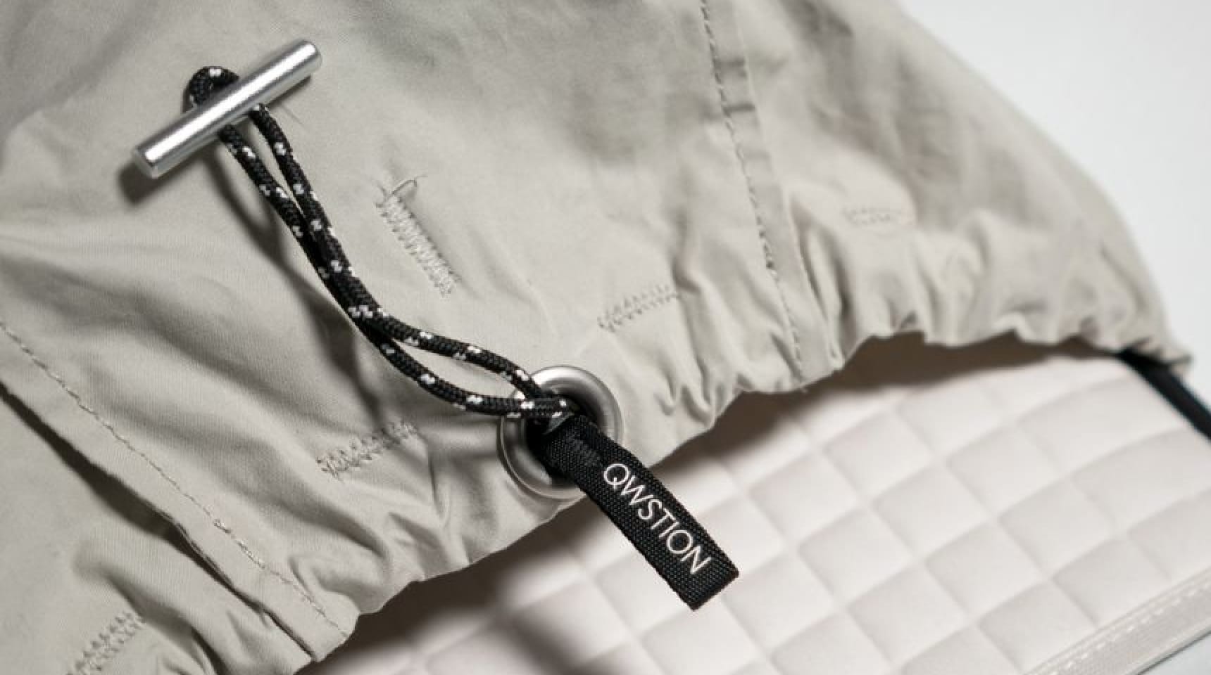
                Our patented padded snack sleeve construction protects your favorite treats from getting smooshed during
                all-day adventures, long shifts at work, and tough travel schedules.
              </p>
            </div>

            <div className="mt-16 grid grid-cols-1 gap-y-16 lg:grid-cols-2 lg:gap-x-8">
              <div>
                <img
                  alt="Drawstring top with elastic loop closure and textured interior padding."
                  src="https://tailwindcss.com/plus-assets/img/ecommerce-images/product-page-04-detail-product-shot-01.jpg"
                  className="aspect-3/2 w-full rounded-lg object-cover"
                />
                <p className="mt-8 text-base text-gray-500">
                  The 20L model has enough space for 370 candy bars, 6 cylinders of chips, 1,220 standard gumballs, or
                  any combination of on-the-go treats that your heart desires. Yes, we did the math.
                </p>
              </div>
              <div>
                <img
                  alt="Front zipper pouch with included key ring."
                  src="https://tailwindcss.com/plus-assets/img/ecommerce-images/product-page-04-detail-product-shot-02.jpg"
                  className="aspect-3/2 w-full rounded-lg object-cover"
                />
                <p className="mt-8 text-base text-gray-500">
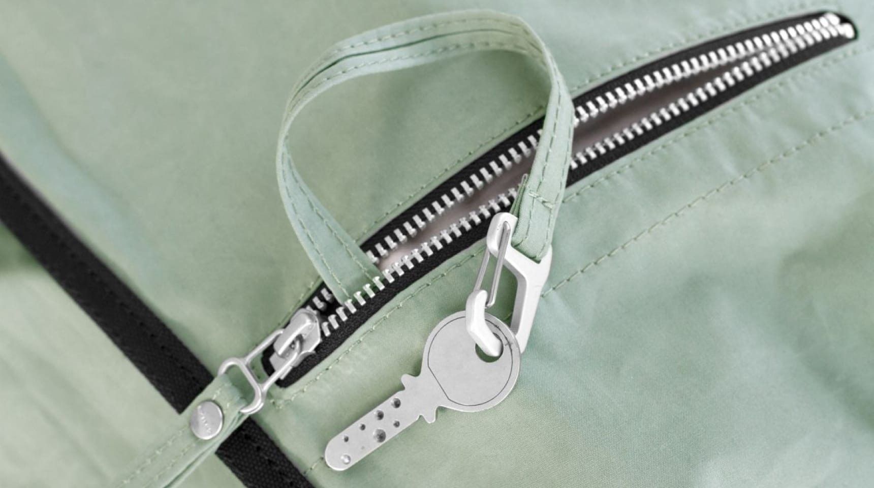
                  Up your snack organization game with multiple compartment options. The quick-access stash pouch is
                  ready for even the most unexpected snack attacks and sharing needs.
                </p>
              </div>
            </div>
          </section>

          {/* Policies section */}
          <section aria-labelledby="policy-heading" className="mt-16 lg:mt-24">
            <h2 id="policy-heading" className="sr-only">
              Our policies
            </h2>
            <div className="grid grid-cols-1 gap-y-12 sm:grid-cols-2 sm:gap-x-6 lg:grid-cols-4 lg:gap-x-8">
              {policies.map((policy) => (
                <div key={policy.name}>
                  <img alt="" src={policy.imageSrc} className="h-24 w-auto" />
                  <h3 className="mt-6 text-base font-medium text-gray-900">{policy.name}</h3>
                  <p className="mt-3 text-base text-gray-500">{policy.description}</p>
                </div>
              ))}
            </div>
          </section>
        </div>

        <section aria-labelledby="reviews-heading" className="bg-white">
          <div className="mx-auto max-w-2xl px-4 py-24 sm:px-6 lg:grid lg:max-w-7xl lg:grid-cols-12 lg:gap-x-8 lg:px-8 lg:py-32">
            <div className="lg:col-span-4">
              <h2 id="reviews-heading" className="text-2xl font-bold tracking-tight text-gray-900">
                Customer Reviews
              </h2>

              <div className="mt-3 flex items-center">
                <div>
                  <div className="flex items-center">
                    {[0, 1, 2, 3, 4].map((rating) => (
                      <StarIcon
                        key={rating}
                        aria-hidden="true"
                        className={classNames(
                          reviews.average > rating ? 'text-yellow-400' : 'text-gray-300',
                          'size-5 shrink-0',
                        )}
                      />
                    ))}
                  </div>
                  <p className="sr-only">{reviews.average} out of 5 stars</p>
                </div>
                <p className="ml-2 text-sm text-gray-900">Based on {reviews.totalCount} reviews</p>
              </div>

              <div className="mt-6">
                <h3 className="sr-only">Review data</h3>

                <dl className="space-y-3">
                  {reviews.counts.map((count) => (
                    <div key={count.rating} className="flex items-center text-sm">
                      <dt className="flex flex-1 items-center">
                        <p className="w-3 font-medium text-gray-900">
                          {count.rating}
                          <span className="sr-only"> star reviews</span>
                        </p>
                        <div aria-hidden="true" className="ml-1 flex flex-1 items-center">
                          <StarIcon
                            aria-hidden="true"
                            className={classNames(
                              count.count > 0 ? 'text-yellow-400' : 'text-gray-300',
                              'size-5 shrink-0',
                            )}
                          />

                          <div className="relative ml-3 flex-1">
                            <div className="h-3 rounded-full border border-gray-200 bg-gray-100" />
                            {count.count > 0 ? (
                              <div
                                style={{ width: `calc(${count.count} / ${reviews.totalCount} * 100%)` }}
                                className="absolute inset-y-0 rounded-full border border-yellow-400 bg-yellow-400"
                              />
                            ) : null}
                          </div>
                        </div>
                      </dt>
                      <dd className="ml-3 w-10 text-right text-sm text-gray-900 tabular-nums">
                        {Math.round((count.count / reviews.totalCount) * 100)}%
                      </dd>
                    </div>
                  ))}
                </dl>
              </div>

              <div className="mt-10">
                <h3 className="text-lg font-medium text-gray-900">Share your thoughts</h3>
                <p className="mt-1 text-sm text-gray-600">
                  If you’ve used this product, share your thoughts with other customers
                </p>

                <a
                  href="#"
                  className="mt-6 inline-flex w-full items-center justify-center rounded-md border border-gray-300 bg-white px-8 py-2 text-sm font-medium text-gray-900 hover:bg-gray-50 sm:w-auto lg:w-full"
                >
                  Write a review
                </a>
              </div>
            </div>

            <div className="mt-16 lg:col-span-7 lg:col-start-6 lg:mt-0">
              <h3 className="sr-only">Recent reviews</h3>

              <div className="flow-root">
                <div className="-my-12 divide-y divide-gray-200">
                  {reviews.featured.map((review) => (
                    <div key={review.id} className="py-12">
                      <div className="flex items-center">
                        <img alt={`${review.author}.`} src={review.avatarSrc} className="size-12 rounded-full" />
                        <div className="ml-4">
                          <h4 className="text-sm font-bold text-gray-900">{review.author}</h4>
                          <div className="mt-1 flex items-center">
                            {[0, 1, 2, 3, 4].map((rating) => (
                              <StarIcon
                                key={rating}
                                aria-hidden="true"
                                className={classNames(
                                  review.rating > rating ? 'text-yellow-400' : 'text-gray-300',
                                  'size-5 shrink-0',
                                )}
                              />
                            ))}
                          </div>
                          <p className="sr-only">{review.rating} out of 5 stars</p>
                        </div>
                      </div>

                      <div
                        dangerouslySetInnerHTML={{ __html: review.content }}
                        className="mt-4 space-y-6 text-base text-gray-600 italic"
                      />
                    </div>
                  ))}
                </div>
              </div>
            </div>
          </div>
        </section>
      </main>

      <footer aria-labelledby="footer-heading" className="bg-white">
        <h2 id="footer-heading" className="sr-only">
          Footer
        </h2>
        <div className="mx-auto max-w-7xl px-4 sm:px-6 lg:px-8">
          <div className="border-t border-gray-200 py-20">
            <div className="grid grid-cols-1 md:grid-flow-col md:auto-rows-min md:grid-cols-12 md:gap-x-8 md:gap-y-16">
              {/* Image section */}
              <div className="col-span-1 md:col-span-2 lg:col-start-1 lg:row-start-1">
                <img
                  alt=""
                  src="https://tailwindcss.com/plus-assets/img/logos/mark.svg?color=indigo&shade=600"
                  className="h-8 w-auto"
                />
              </div>

              {/* Sitemap sections */}
              <div className="col-span-6 mt-10 grid grid-cols-2 gap-8 sm:grid-cols-3 md:col-span-8 md:col-start-3 md:row-start-1 md:mt-0 lg:col-span-6 lg:col-start-2">
                <div className="grid grid-cols-1 gap-y-12 sm:col-span-2 sm:grid-cols-2 sm:gap-x-8">
                  <div>
                    <h3 className="text-sm font-medium text-gray-900">Products</h3>
                    <ul role="list" className="mt-6 space-y-6">
                      {footerNavigation.products.map((item) => (
                        <li key={item.name} className="text-sm">
                          <a href={item.href} className="text-gray-500 hover:text-gray-600">
                            {item.name}
                          </a>
                        </li>
                      ))}
                    </ul>
                  </div>
                  <div>
                    <h3 className="text-sm font-medium text-gray-900">Company</h3>
                    <ul role="list" className="mt-6 space-y-6">
                      {footerNavigation.company.map((item) => (
                        <li key={item.name} className="text-sm">
                          <a href={item.href} className="text-gray-500 hover:text-gray-600">
                            {item.name}
                          </a>
                        </li>
                      ))}
                    </ul>
                  </div>
                </div>
                <div>
                  <h3 className="text-sm font-medium text-gray-900">Customer Service</h3>
                  <ul role="list" className="mt-6 space-y-6">
                    {footerNavigation.customerService.map((item) => (
                      <li key={item.name} className="text-sm">
                        <a href={item.href} className="text-gray-500 hover:text-gray-600">
                          {item.name}
                        </a>
                      </li>
                    ))}
                  </ul>
                </div>
              </div>

              {/* Newsletter section */}
              <div className="mt-12 md:col-span-8 md:col-start-3 md:row-start-2 md:mt-0 lg:col-span-4 lg:col-start-9 lg:row-start-1">
                <h3 className="text-sm font-medium text-gray-900">Sign up for our newsletter</h3>
                <p className="mt-6 text-sm text-gray-500">The latest deals and savings, sent to your inbox weekly.</p>
                <form className="mt-2 flex sm:max-w-md">
                  <input
                    id="email-address"
                    type="text"
                    required
                    autoComplete="email"
                    aria-label="Email address"
                    className="block w-full rounded-md bg-white px-4 py-2 text-base text-gray-900 outline-1 -outline-offset-1 outline-gray-300 placeholder:text-gray-400 focus:outline-2 focus:-outline-offset-2 focus:outline-indigo-600"
                  />
                  <div className="ml-4 shrink-0">
                    <button
                      type="submit"
                      className="flex w-full items-center justify-center rounded-md border border-transparent bg-indigo-600 px-4 py-2 text-base font-medium text-white shadow-xs hover:bg-indigo-700 focus:ring-2 focus:ring-indigo-500 focus:ring-offset-2 focus:outline-hidden"
                    >
                      Sign up
                    </button>
                  </div>
                </form>
              </div>
            </div>
          </div>

          <div className="border-t border-gray-100 py-10 text-center">
            <p className="text-sm text-gray-500">&copy; 2021 Your Company, Inc. All rights reserved.</p>
          </div>
        </div>
      </footer>
    </div>
  )
}
